Money Tracker

Background
As I got older, I realized how important it is to manage my money properly. I need to know where my income comes from, what I spend it on, and how much I’m using. That’s the only way to keep my spending under control, except for rare big expenses like buying a laptop, traveling, or paying for my parents’ medical bills.
I’ve been using Money Manager since I started working. It covers the basics: transaction records, monthly stats, custom categories, payday settings, search, and Excel export.
The problem is, everything stays on one device. If I switch phones, I need to back up and import data manually. And later, in case I’m married, I’d want both me and my partner to track our finances together from our own phones. The app can’t do that.
So I built my own expense tracker app that stores data in the cloud, allowing both of us to log in from different devices and see the same financial data in real time.
The app
A lot of people are doing vibe coding these days, and I kind of get why. When I got the idea for this app, I figured it was the perfect time to try that approach too. I didn’t want to overthink or spend forever setting things up. I just wanted to build fast and see it work.
At first, it was pure vibe coding: generating code with prompts, tweaking a bit, and moving on. Once things started working, I went back to clean up, debug, and polish the details manually.
I used Astro to go fullstack easily, with React, Tailwind, and shadcn on the frontend, and Supabase for the backend. The stack is intentionally simple since the main goal is personal use. This combination made development quick without much setup overhead.
The features
Transactions
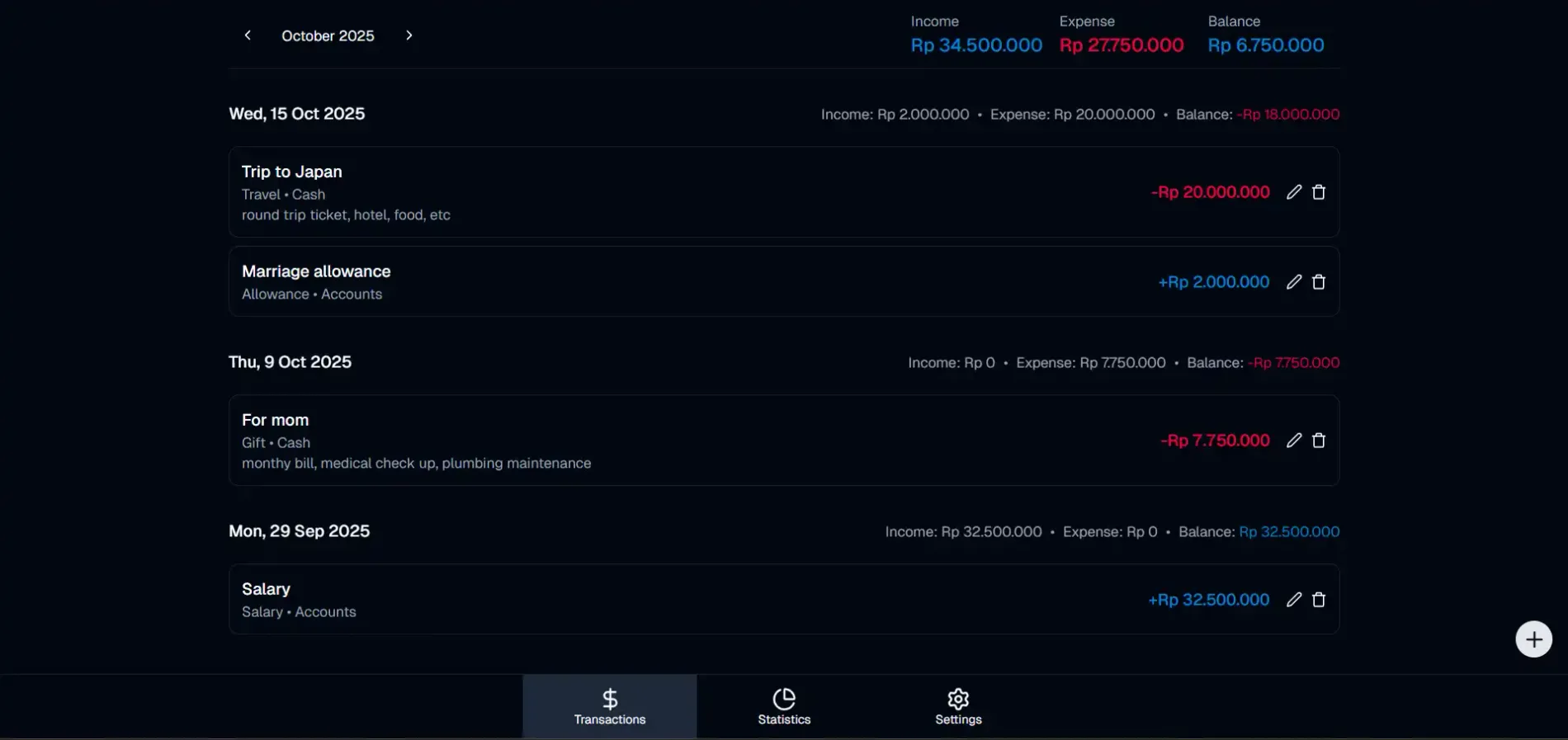
When you open the app, you land on the Transactions page. All your transactions for the selected month are listed by date, along with total income, expenses, and balance at the top. You can switch between months to review past spending or compare your finances over time.
Each transaction shows details like category, account, and a short note to remind you what it was for. You can easily edit or delete any transaction directly from the list.
Adding or editing a transaction is straightforward. You can set whether it’s Income or Expense, fill in the date, amount, category, account (such as Cash, Account, or Card), and a short note. The form is intentionally minimal to make input fast and consistent.
I’ve also added an Advanced Search feature that lets you filter transactions by keyword, category, date range, or amount range. This makes it easy to find specific expenses or analyze spending over custom periods.
Investments
Tracking cash flow is essential, but building wealth requires investing. I added a dedicated Investment Portfolio module to separate long-term assets from daily spending.
You can record ‘Buy’, ‘Sell’, and ‘Dividend’ actions, specifying the platform, and the asset type (Stocks, Gold, Mutual Funds, Crypto). Similar to transactions, the investment search lets you filter by any of these fields to analyze your portfolio performance.
Statistics
The Statistics page gives a visual summary of your financial health.
For daily finances, two pie charts show Income and Expense distribution by category. You can switch between months to see changes over time. Income categories may include Salary or Business Profit, while expenses can be grouped under Health, Food, Transportation, and others.
For investments, there are new charts to track your portfolio:
- Action Breakdown: See the distribution of your ‘Buy’, ‘Sell’, and ‘Dividend’ activities.
- Portfolio Allocation: visualize your asset distribution (e.g., Stocks vs. Crypto) to help you rebalance effectively.
Settings
The Settings page manages app configurations. You can edit categories, switch themes, and set payday rules here.
Categories can be added, deleted, or rearranged with drag and drop. You can also switch between Light, Dark, or System themes. The Payday Settings section lets you define your payday date and decide what happens if it falls on a weekend, either move it to Friday or Monday.
I also added Investment Settings to manage your portfolio data. You can define custom Investment Types (like Gold, Stock, Crypto) and Platforms (like Bibit, Ajaib). These settings populate dropdown menus when you add a new investment, replacing manual text entry for faster and more consistent tracking.
Future work
I plan to add import and export options for JSON and CSV so data can be easily backed up or restored.
Note
If you want to use the app, avoid registering with an email that clearly identifies you. Since I manage the database myself, I technically have access to all stored data. For privacy, it’s better to use a secondary or throwaway email.

